Glowing magical vector logo
Try to make this indeed easy and educative vector logo using Blending options.
Also take a look at other Photoshop tutorials...
Light in the Tower | Pre-press tips for Photoshop users | Exploding text | Making tiles | Tattoo transplantation |
Glowing magical vector logo
To make such a cool logo, follow these steps. The main Agvatage of this tutorial is that you will be able to change the text even after you have finished all the effects. cool.Here is the vision we will hopefully achieve:

1. We will need some cool font. We want the logo to look a bit mystical and magical. I have used font Colonna MT. It ought to be already on your XP system. If not, you can download it for free here.
2. The other thingy taht is quite crucial for making exact text effects is this one.
You need to have the font size similar to the mine (the best thing is to have it exactly the same size) so that when I use some effect with some specific strength or amount, it will produce different results for different sizes of font. Is that clear.
You may ask "Does that mean I have to have my logo the same size as you do?" Well the answer is of coursse no. We are using my size of fonts just for you to make the exact effects and with exact outcome as I did.
When we finish the effects, you will change the font to whatever size you wish and use this very handy function: Layer/Layer style/Scale effects. It will enable you to change the scale of the effects so that you will be able to make it fit exactly for your font size. cool.
3. Make black background.
4. use the font I told you about (well, or any other) to make the text of your logo.

5. Next is to open the Blending options by double clisk on the layer. We will assign certain settings to the effects and just finetune the result.
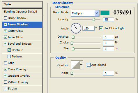
6. Inner shadow
7. Outer Glow
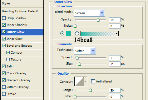
so far, it ought look like this

8. Inne glow
it will not be visible now but later on, it will make tiny little yellow line, that will be really cute :)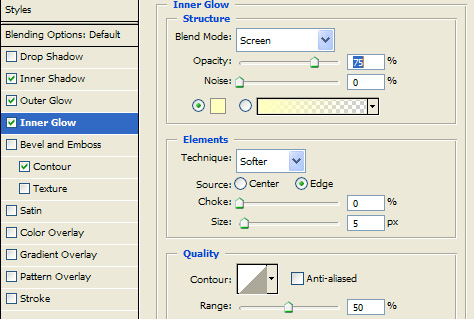
9. Bevel and Emboss
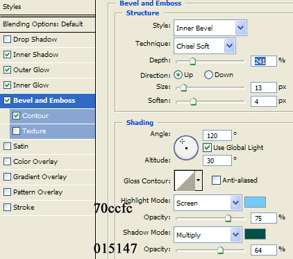
Again, so far we should have this one:

10.Color Overlay

11. Gradient overlay
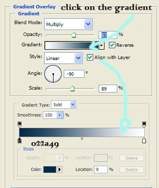
So, now the style is almost complete. In my case, for this big T it is complete. It should look like this:

12. The next stage (in my case) is to make the second writing, smaller and more clear.

13. What we do now is that we right click on the big T layer, select Copy Style, next click on the titan layer and again right click and Paste Style.
It should look like this.

14. Some minor changes
The first thing is that we change the Bevel and Emboss option in Blending Options to these settings: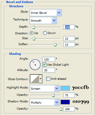
15. The other step, in fact the final one is to set the Satin option (again in Blanding Options) to the following settings
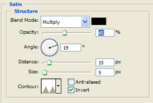
16. So the outcome ought to be something like this.
So, worth doing? Please vote in the section below.
Hope you enjoyed :)

So that is the final one, hope you have enjoyed :) If yes(?), please vote in the section below, and I would be pleased if you could leave a comment on this tutorial in the section below :D And check other of our tutorials as well.
Submitted by Martin on 2007-02-27 11:56:28. Since then read 59638 times.
Scored 4.22 points out of maximum 5 by 72 votes.
Also take a look at other Photoshop tutorials...
Retouch of panorama | Light in the Tower | Autumn leaves | Vacation and holiday accessories tips | Chrome effect |
Rate this tutorial!
Invite a friend!
Discussion
phunb phudhxd AT yahoo DOT com said on 2007-03-13 02:57:56Good!
K said on 2008-01-29 00:39:22
good tut...but i love how u stress using the same font size as u in the beginning so tat we get the same effect but don't tell us the font size that u used -.-
Sukhchain Singh said on 2008-02-14 07:09:56
It is very beautiful.............It give me lot of information and knowledge. Good Job..........!!!!!!!!!
Nightfirecat jordnhere AT comcast DOT net said on 2008-02-14 18:35:03
Pretty cool. I used just the letter, not the word in front... That didn't work out so well with a large word (since the text type would have to be smaller to be on one line...) I just made it a bit of a deeper blue, and reduced the inner glow, and it looked great!
Bino bino AT yahoo DOT com said on 2008-06-14 12:35:50
visit my site www.codepal.co.in
bubby. bleeding_lonely_tears AT yahoo DOT com said on 2008-09-29 19:15:46
ack. sweet. i love it. typos were a little distracting, and i love how a previous "reviewer" mentioned that you didn't give the name of the font. (COLONNA MT). =3 i liked it, though.

